> ## Documentation Index
> Fetch the complete documentation index at: https://architect-d889a35e-sync-pr-4286.mintlify.site/llms.txt
> Use this file to discover all available pages before exploring further.
# Different Page Components
> Examples of every component type available for Architect pages
Slices are the building blocks of an Architect page. Think of them as reusable page components (text, images, tables, testimonials, CTAs) that the agent assembles into a full page based on your page context.
## **Hero**
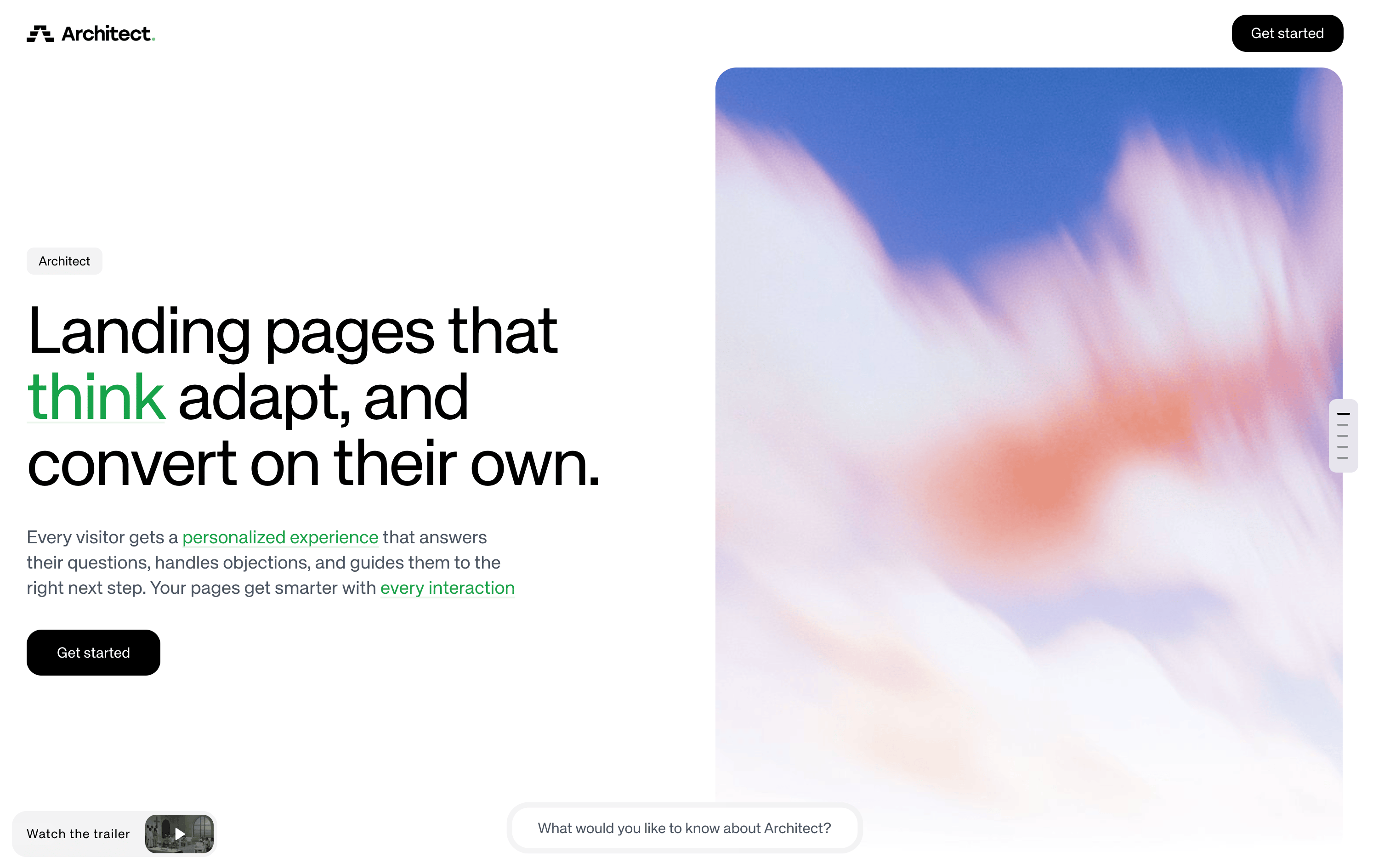 **Best Used For:** Creating the **first impression of a page** with a prominent heading, subtitle, and call-to-action. The Hero is a page-level component (not a regular slice) that sits at the very top of the page and sets the tone for the entire experience. Only one Hero can exist per page.
The Hero includes the following elements:
* **Eyebrow** - A short label or brand tag displayed as a pill/badge above the headline
* **Main** - The primary headline rendered as a large `h1`, supports keyword highlighting for interactive hover metadata
* **Content** - Supporting body copy below the headline (1-3 sentences)
* **CTA buttons** - A primary and optional secondary call-to-action button (supports `open-url`, `copy-text`, and `form` action types)
* **Image** - An optional hero image displayed alongside the text content
* **Background image / color** - An optional full-bleed background behind the entire Hero section
### Layout formats
The Hero supports two layout formats:
* **Row** (default) - A side-by-side two-column layout with text content on the left and the hero image on the right. This is the recommended format when a hero image is provided.
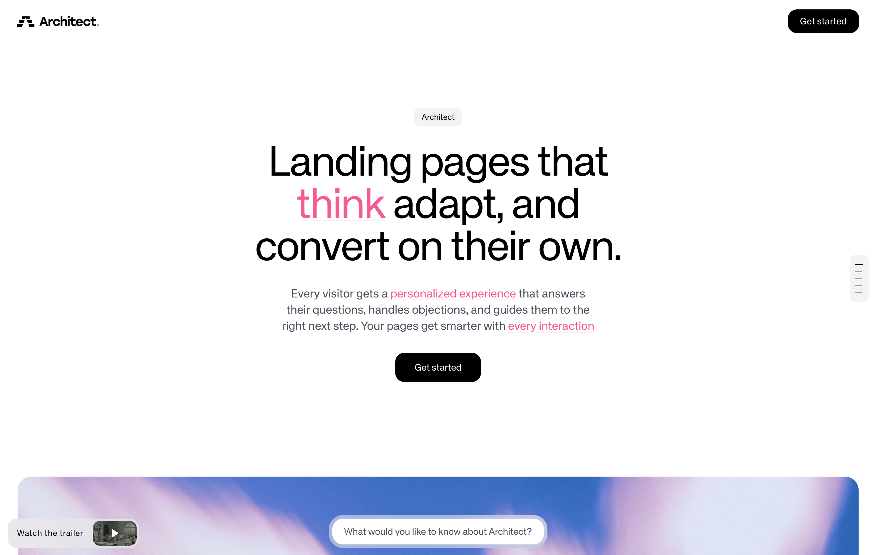
* **Column** - A vertically stacked layout where all content is centered on the page. The image (if present) appears below the text.
**Best Used For:** Creating the **first impression of a page** with a prominent heading, subtitle, and call-to-action. The Hero is a page-level component (not a regular slice) that sits at the very top of the page and sets the tone for the entire experience. Only one Hero can exist per page.
The Hero includes the following elements:
* **Eyebrow** - A short label or brand tag displayed as a pill/badge above the headline
* **Main** - The primary headline rendered as a large `h1`, supports keyword highlighting for interactive hover metadata
* **Content** - Supporting body copy below the headline (1-3 sentences)
* **CTA buttons** - A primary and optional secondary call-to-action button (supports `open-url`, `copy-text`, and `form` action types)
* **Image** - An optional hero image displayed alongside the text content
* **Background image / color** - An optional full-bleed background behind the entire Hero section
### Layout formats
The Hero supports two layout formats:
* **Row** (default) - A side-by-side two-column layout with text content on the left and the hero image on the right. This is the recommended format when a hero image is provided.
* **Column** - A vertically stacked layout where all content is centered on the page. The image (if present) appears below the text.
 ***
## **TextContainer**
***
## **TextContainer**
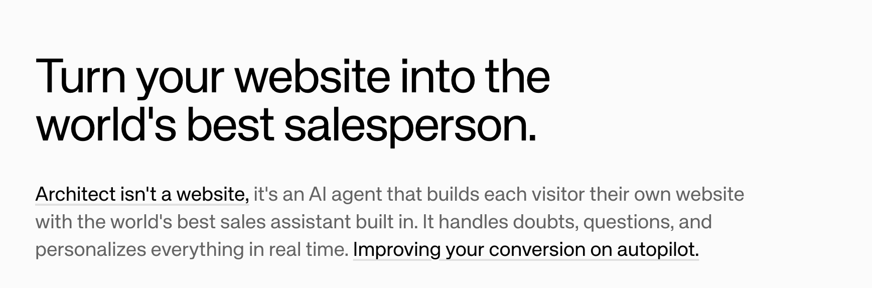 **Best Used For:** Rendering **formatted text content** with markdown support including headings, bold, italic, links, lists, and inline code. Supports keyword highlighting for interactive hover metadata. This is the foundational component for any text-heavy content.
Text types include:
* **hero** - Large heading for the start of a page
* **headline** - Section heading for content breaks
* **body** - Standard paragraph text
***
## **ImageContainer**
**Best Used For:** Rendering **formatted text content** with markdown support including headings, bold, italic, links, lists, and inline code. Supports keyword highlighting for interactive hover metadata. This is the foundational component for any text-heavy content.
Text types include:
* **hero** - Large heading for the start of a page
* **headline** - Section heading for content breaks
* **body** - Standard paragraph text
***
## **ImageContainer**
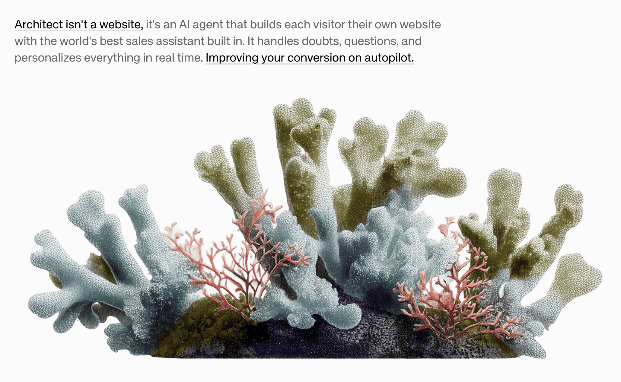 **Best Used For:** Displaying **responsive images** with optional alt text for accessibility. Supports size variants:
* **small** - 60% width, centered
* **medium** - 100% width (default)
* **large** - 60vw (breaks out of container)
* **full** - 100vw (full bleed)
***
## **VideoContainer**
**Best Used For:** Displaying **responsive images** with optional alt text for accessibility. Supports size variants:
* **small** - 60% width, centered
* **medium** - 100% width (default)
* **large** - 60vw (breaks out of container)
* **full** - 100vw (full bleed)
***
## **VideoContainer**
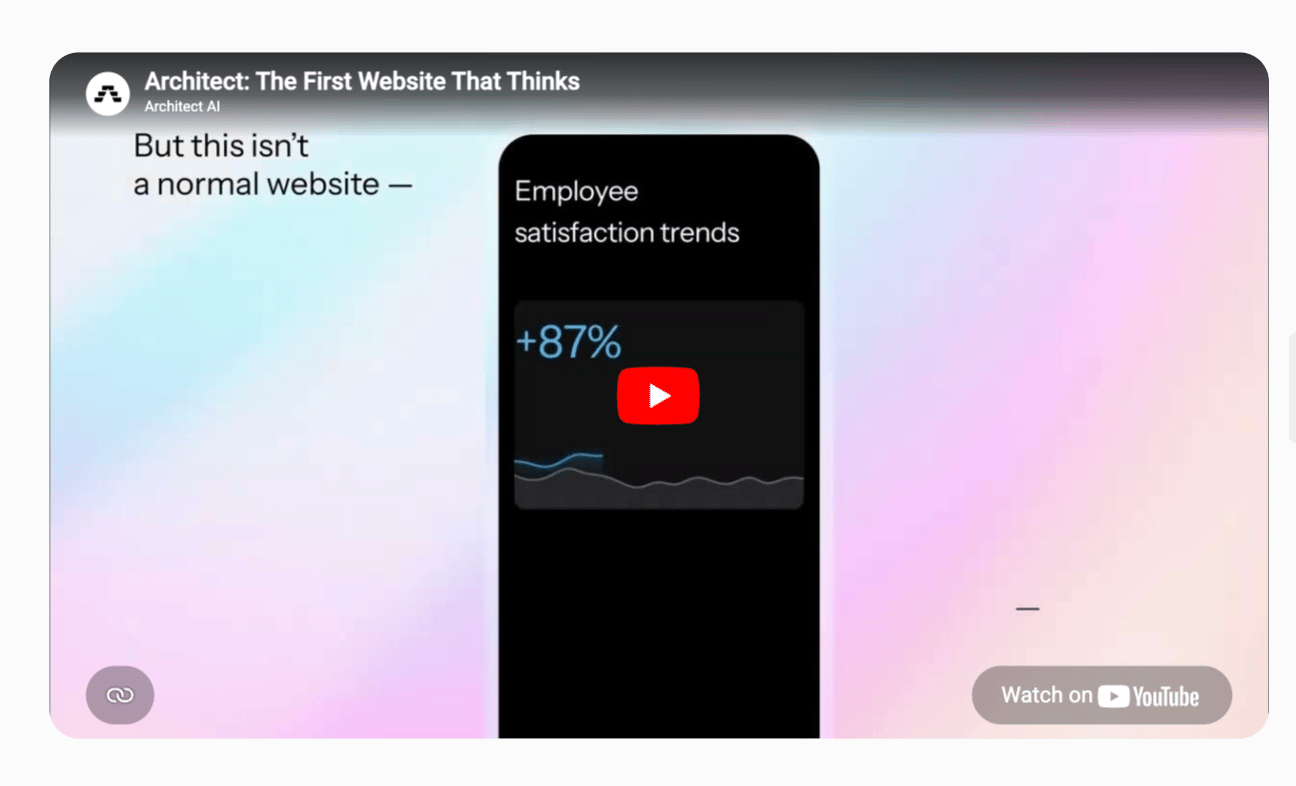 **Best Used For:** Embedding **video content** directly into a page. Video is one of the highest-converting assets for landing pages, making this slice ideal for product demos, explainer videos, or customer story recordings.
***
## **Table**
**Best Used For:** Embedding **video content** directly into a page. Video is one of the highest-converting assets for landing pages, making this slice ideal for product demos, explainer videos, or customer story recordings.
***
## **Table**
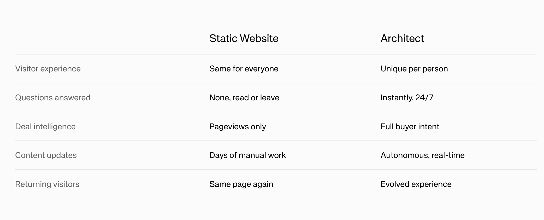 **Best Used For:** Organizing and displaying **structured, tabular data** with column headers and rows. Ideal for pricing comparisons, feature matrices, specifications, or any two-dimensional data that benefits from a grid layout with striped rows and hover effects.
You can optionally highlight a specific column to draw attention to it (e.g., highlighting your product in a comparison table). Set `highlightedColumnIndex` to the 0-based index of the column you want to emphasize, or leave it unset for no highlight.
***
## **FeatureCards**
**Best Used For:** Organizing and displaying **structured, tabular data** with column headers and rows. Ideal for pricing comparisons, feature matrices, specifications, or any two-dimensional data that benefits from a grid layout with striped rows and hover effects.
You can optionally highlight a specific column to draw attention to it (e.g., highlighting your product in a comparison table). Set `highlightedColumnIndex` to the 0-based index of the column you want to emphasize, or leave it unset for no highlight.
***
## **FeatureCards**
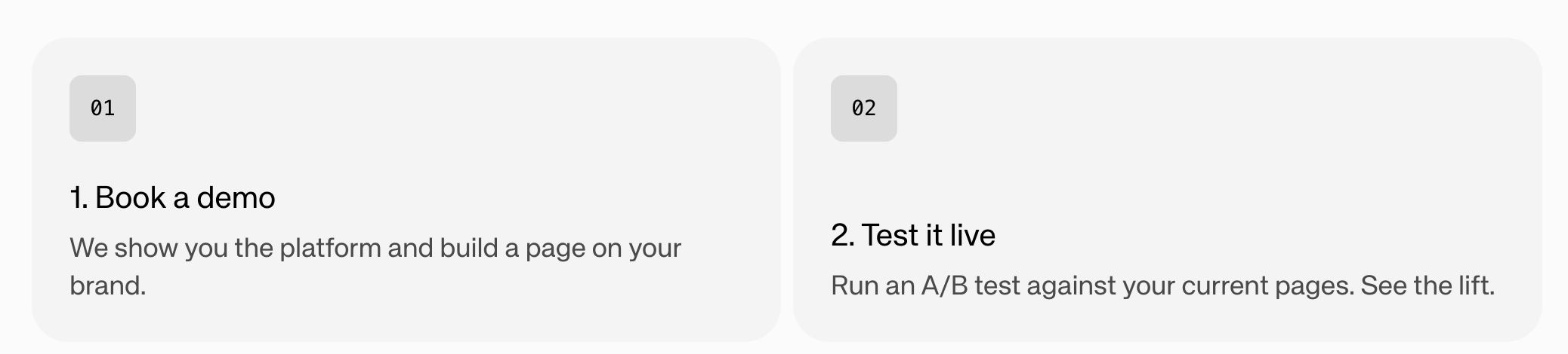 **Best Used For:** Presenting **2-6 features, benefits, or value propositions** in a scannable card grid layout (up to 3 per row). Each card contains:
* Headline (2-5 words)
* Content description (1-2 sentences)
* Optional icon
* Optional feature image
### With images
FeatureCards also support an image mode where each card includes a prominent visual alongside the text content.
**Best Used For:** Presenting **2-6 features, benefits, or value propositions** in a scannable card grid layout (up to 3 per row). Each card contains:
* Headline (2-5 words)
* Content description (1-2 sentences)
* Optional icon
* Optional feature image
### With images
FeatureCards also support an image mode where each card includes a prominent visual alongside the text content.
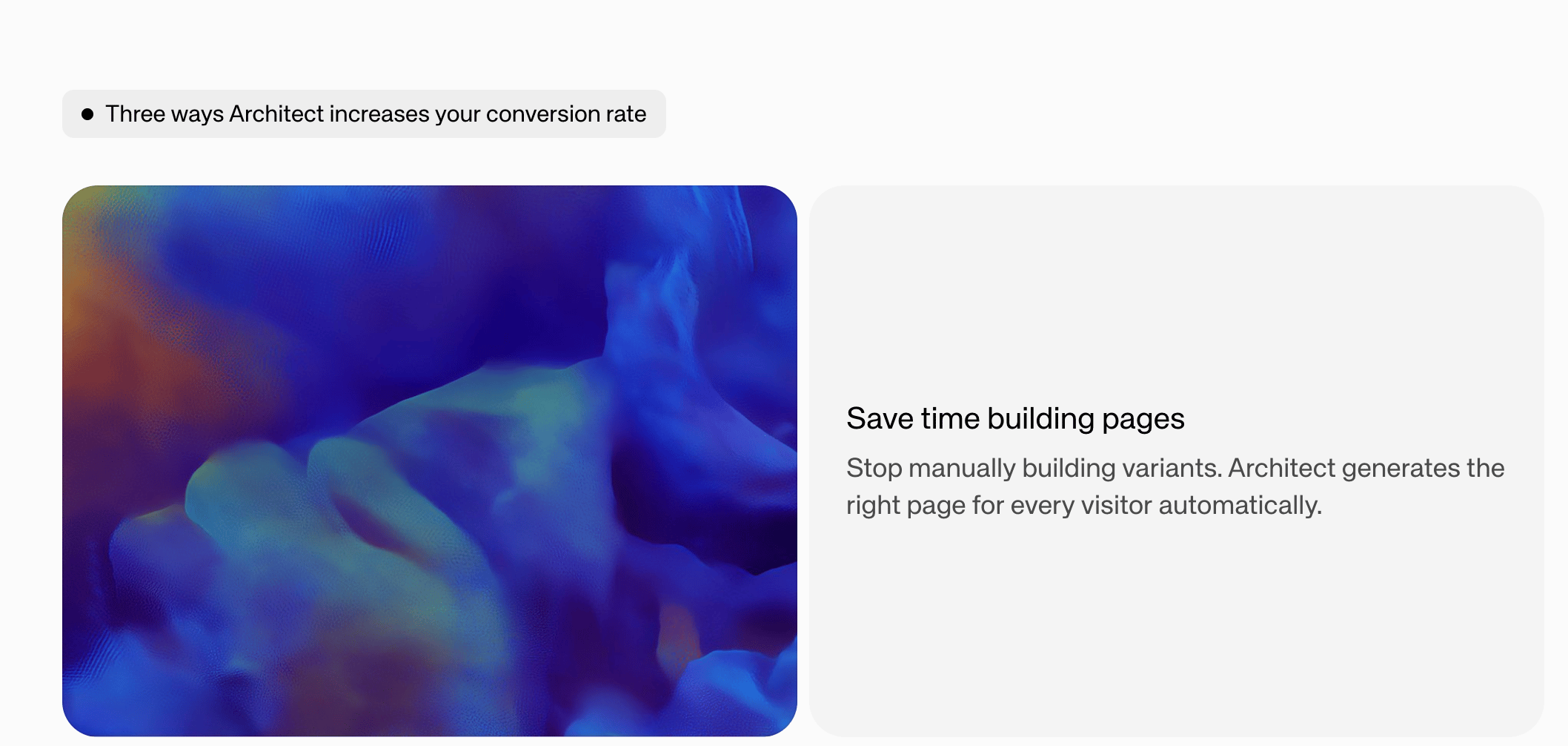 Supports `imageMode: fill` (photos) or `contain` (diagrams/logos).
***
## **Frame**
Supports `imageMode: fill` (photos) or `contain` (diagrams/logos).
***
## **Frame**
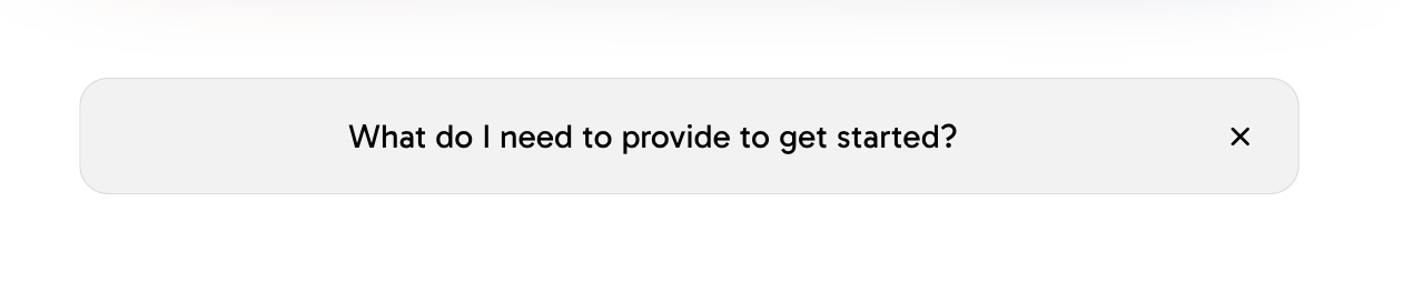 **Best Used For:** Creating **collapsible, expandable sections** that organize related content under a header title. Frames can contain child components and are ideal for:
* FAQ-style expandable sections
* Progressive disclosure of detailed information
* Grouping related content with show/hide functionality
***
## **FrameList**
**Best Used For:** Creating **collapsible, expandable sections** that organize related content under a header title. Frames can contain child components and are ideal for:
* FAQ-style expandable sections
* Progressive disclosure of detailed information
* Grouping related content with show/hide functionality
***
## **FrameList**
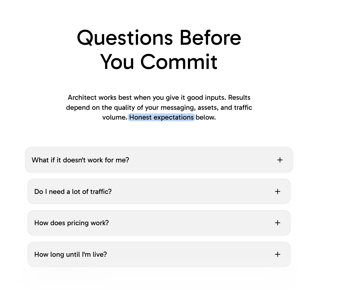 **Best Used For:** **Grouping multiple Frame components** with tighter spacing. Use when frames should appear closer together as a cohesive unit (e.g., a series of FAQ items or related expandable sections).
***
## **TestimonialCarousel**
**Best Used For:** **Grouping multiple Frame components** with tighter spacing. Use when frames should appear closer together as a cohesive unit (e.g., a series of FAQ items or related expandable sections).
***
## **TestimonialCarousel**
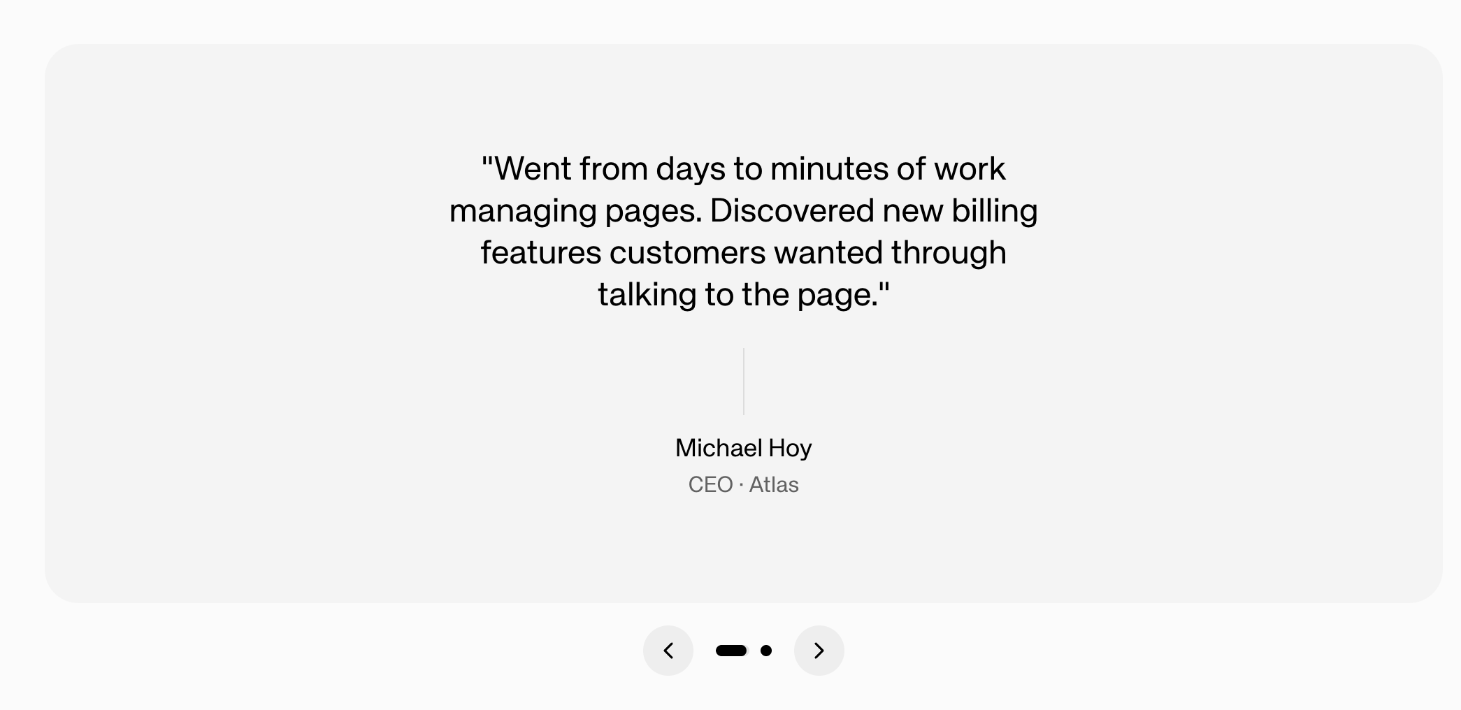 **Best Used For:** Adding **social proof** through rotating customer testimonials displayed as a horizontal carousel with quote styling. Each testimonial includes:
* Quote text (15-40 words, customer's voice)
* Author name
* Optional title/role
* Optional company name
Includes navigation arrows and dots for browsing multiple testimonials.
***
## **CallToActionCard**
**Best Used For:** Adding **social proof** through rotating customer testimonials displayed as a horizontal carousel with quote styling. Each testimonial includes:
* Quote text (15-40 words, customer's voice)
* Author name
* Optional title/role
* Optional company name
Includes navigation arrows and dots for browsing multiple testimonials.
***
## **CallToActionCard**
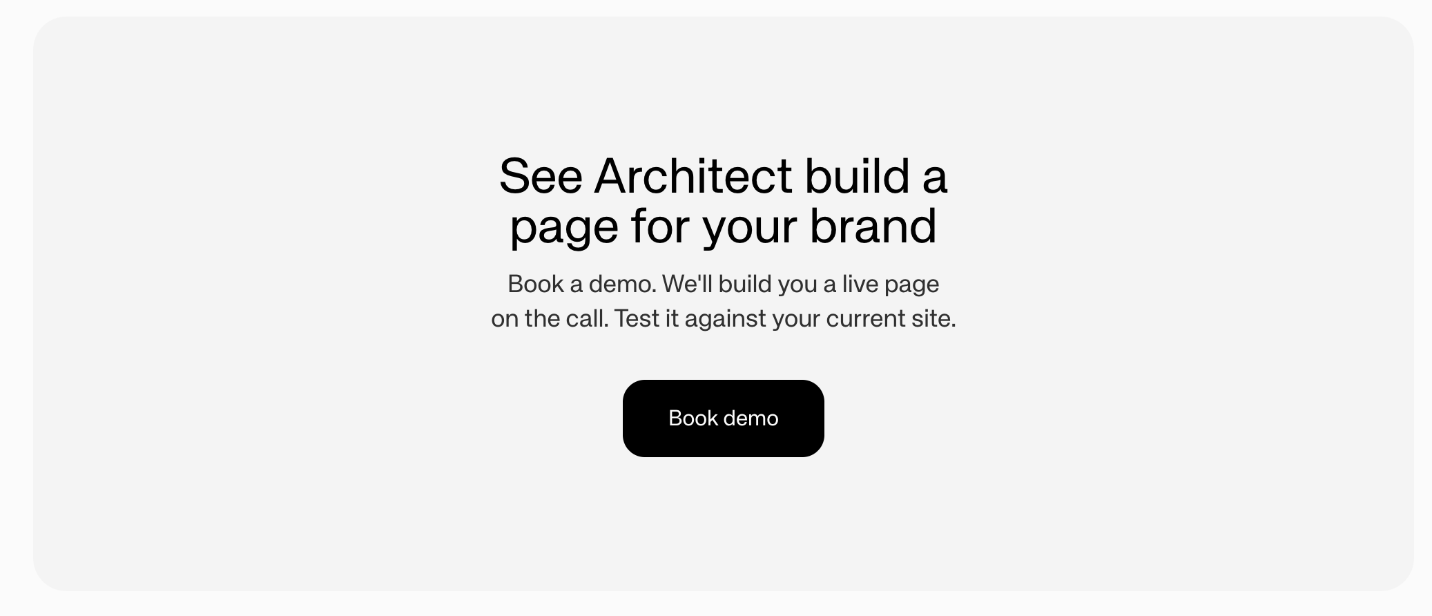 **Best Used For:** Creating a **prominent conversion point** with a bold headline (5-10 words), supporting description (1-2 sentences), and an action button. Actions can be:
* **open-url** - Navigate to a URL
* **form** - Open an email capture form modal
***
## **Threads**
**Best Used For:** Creating a **prominent conversion point** with a bold headline (5-10 words), supporting description (1-2 sentences), and an action button. Actions can be:
* **open-url** - Navigate to a URL
* **form** - Open an email capture form modal
***
## **Threads**
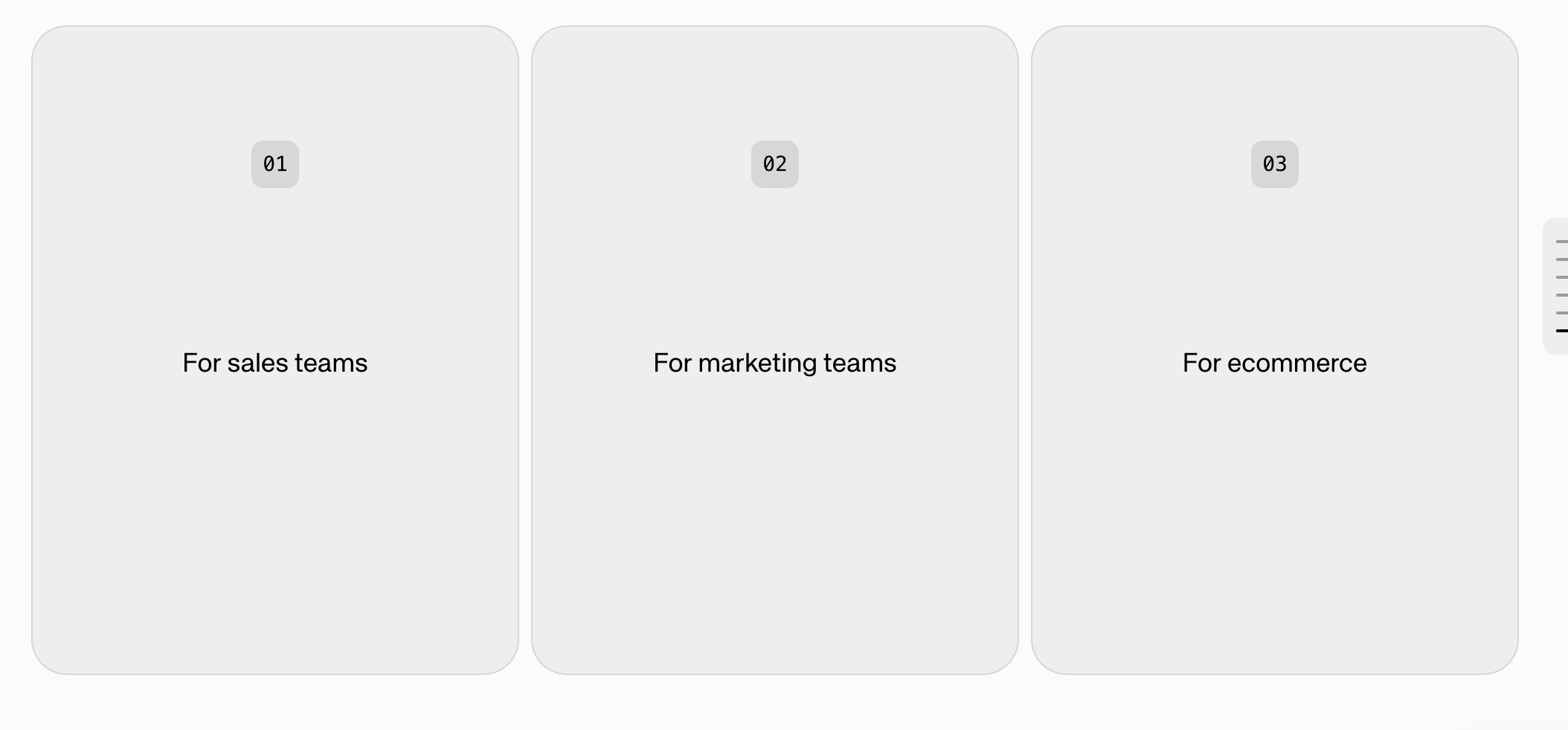 **Best Used For:** Enabling **conversation continuation and user interaction**.
* Presents a question with 2-4 selectable options
* Each option has a label and action
* **Qualifies users** by gathering information (company size, needs, budget)
* Dynamically routes users to appropriate content paths
***
## **StatsCards**
**Best Used For:** Enabling **conversation continuation and user interaction**.
* Presents a question with 2-4 selectable options
* Each option has a label and action
* **Qualifies users** by gathering information (company size, needs, budget)
* Dynamically routes users to appropriate content paths
***
## **StatsCards**
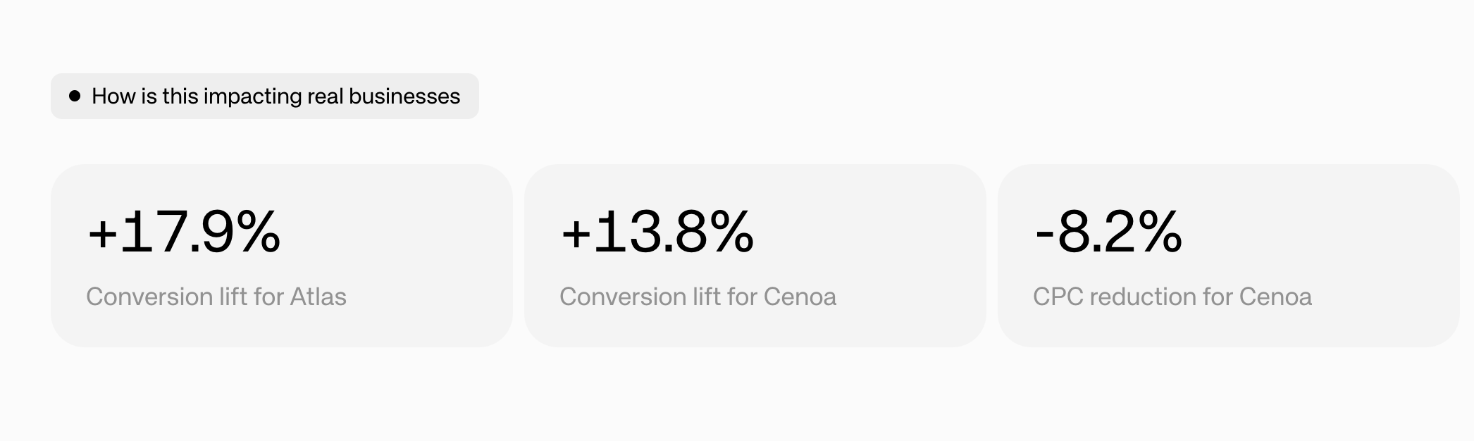 **Best Used For:** Displaying **2-4 highlighted statistics** as large, prominent numbers with labels. Builds credibility by making abstract benefits tangible (e.g., "+17.9%" Conversion lift, "99.9%" Uptime, "\$2M" Revenue Generated). Values can include formatting characters.
***
## **LogoMarquee**
**Best Used For:** Displaying **2-4 highlighted statistics** as large, prominent numbers with labels. Builds credibility by making abstract benefits tangible (e.g., "+17.9%" Conversion lift, "99.9%" Uptime, "\$2M" Revenue Generated). Values can include formatting characters.
***
## **LogoMarquee**
 **Best Used For:** Building **trust and credibility** through a continuously scrolling banner of customer/partner logos (similar to "Trusted by..." sections). Logos are displayed with a grayscale filter for visual consistency. Supports speed control and per-item duration for fine-tuning.
***
## **CustomComponent**
**Best Used For:** Rendering **custom or dynamic components** that don't fit into the standard slice types. Use this for specialized content that requires unique layouts or behavior beyond what the built-in slices provide.
***
## **Footer**
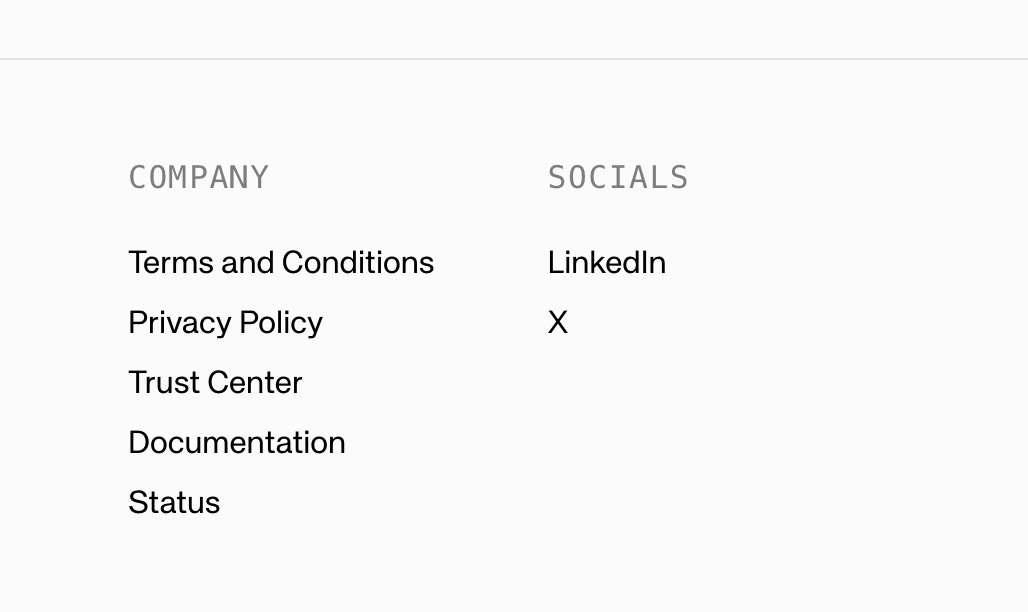
**Best Used For:** Adding a **page footer** with branding, links, or closing content. This is a page-level component that appears at the bottom of the page.
**Best Used For:** Building **trust and credibility** through a continuously scrolling banner of customer/partner logos (similar to "Trusted by..." sections). Logos are displayed with a grayscale filter for visual consistency. Supports speed control and per-item duration for fine-tuning.
***
## **CustomComponent**
**Best Used For:** Rendering **custom or dynamic components** that don't fit into the standard slice types. Use this for specialized content that requires unique layouts or behavior beyond what the built-in slices provide.
***
## **Footer**
**Best Used For:** Adding a **page footer** with branding, links, or closing content. This is a page-level component that appears at the bottom of the page.
 ***
## **Action Widgets**
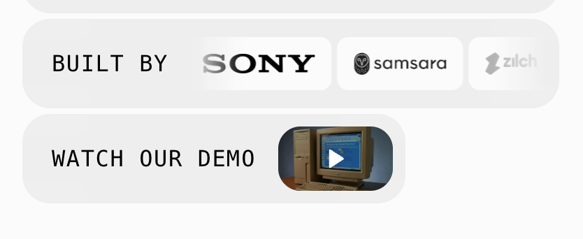
Action widgets are page-level, static components that are set on the page to show trust. We recommend setting these up.
***
## **Action Widgets**
Action widgets are page-level, static components that are set on the page to show trust. We recommend setting these up.
 ***
## **Left Hand Side CTA**
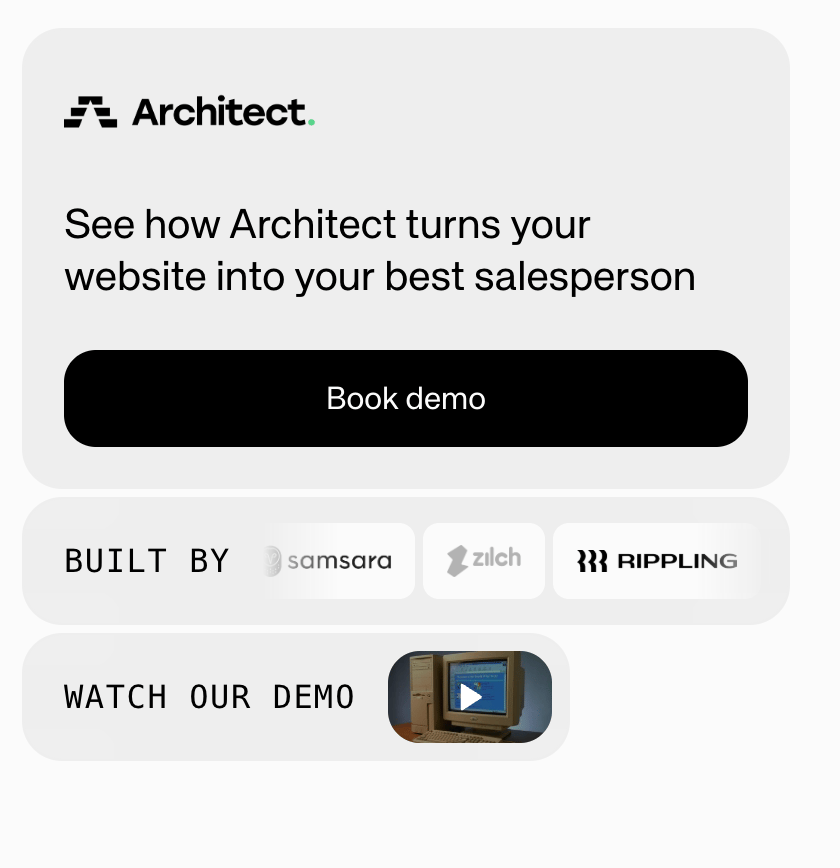
This is the main CTA that follows the user on the page. It is set at the page level as well.
***
## **Left Hand Side CTA**
This is the main CTA that follows the user on the page. It is set at the page level as well.
 ***
## **Question Bar**
The question bar is a constant bar that sits at the bottom of the page where visitors can ask questions. When a user asks a question, more components will automatically generate at the end of the page.
***
## **Question Bar**
The question bar is a constant bar that sits at the bottom of the page where visitors can ask questions. When a user asks a question, more components will automatically generate at the end of the page.